Solidarity Hall logo
A logo undertaken with no budget and cursory brief, intended for a short life, created to signal the nonprofit group it represents was in a phase of transition.
Never a satisfactory identity solution, the update logo continued in use contrary to plan, the expected more thorough redesign indefinitely on hold. It has seen use in a variety of digital and print contexts.
Graphically simple, this logo lent itself to animation.
Door-opening frames vector-drawn individually after automated tweening attempts proved to produce unsuitable results.
Click image to view the 10-sec. title card sequence. (May take a moment to load.)
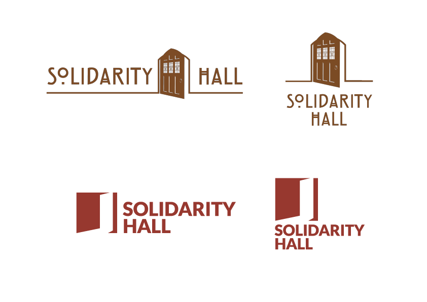
The update logo (bottom) was an unsubtle play on its predecessor (top) — straightforward, but also limited and severe, in approach.
The original logo (designed by others), interestingly, held in tension two uncertainly related ideas: a door’s being opened, on one hand, and the door in its detailing being a sort of concrete period symbol or allusion, on the other. With my update, in contrast, all is stripped away but a blunt, reductive idea of opening / invitation, abstracted and graphically spare.